CSS typewriter animation in React without layout shift
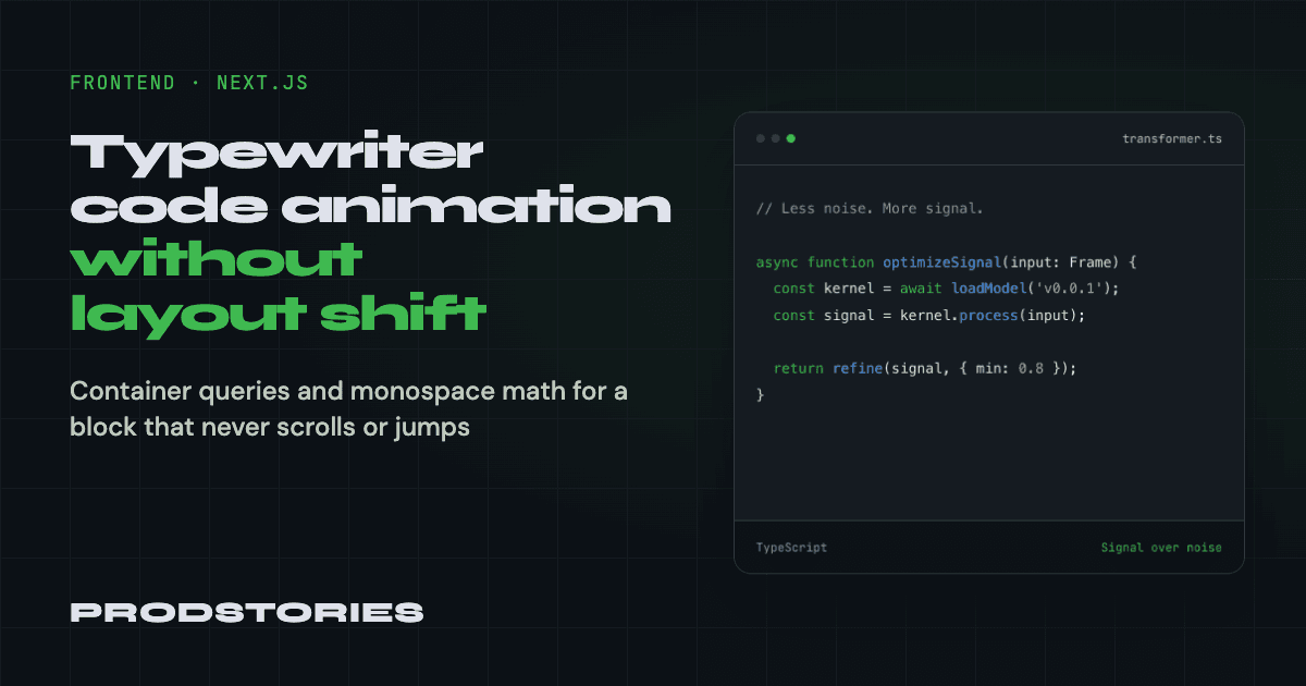
The hero on the ProdStories homepage has a code block on the right: a small editor window with a filename, a TypeScript snippet and a footer. For the first month it was static markup. It looked fine, but the page felt still, so we decided to give the block a typewriter effect: print a snippet, hold it, erase it, move to the next one.
As soon as the code started to move, two problems showed up: the block grew a horizontal scrollbar, and its height jumped with every new line. This post covers how we fixed each one, plus a smaller issue with the first frame. All code is from our repo, a Next.js 16 App Router site.
TL;DR. Reserve the height of the tallest snippet in em, so the block never changes size. Size the font from the block's own width with container-type: inline-size and cqi, so the longest line always fits. Render the first snippet fully typed on the server, and start the animation only when prefers-reduced-motion allows it.
Where we started: a static block
The original block was plain JSX inside the homepage, with the highlighting written by hand:
<pre className={styles.code}>
  <code>
    <span className={styles.codeComment}>{'// Less noise. More signal.\n\n'}</span>
    <span className={styles.codeKeyword}>async function</span>
    {' optimizeSignal() {\n  '}
    ...
  </code>
</pre>.code {
overflow-x: auto;
font-size: clamp(0.6875rem, 1.1vw, 0.8125rem);
line-height: 1.9;
}This worked because nothing in it ever changed. The text was short, the height was whatever the content needed, and overflow-x: auto was a safety net nobody saw. Both of those decisions came back to bite us once the content started moving.
Why the animation became its own component
The homepage is an async Server Component: it fetches featured posts from Payload CMS on the server. An animation needs state, timers and useEffect, so it needs 'use client'. We could not put that on the page itself without moving the data fetching to the client.
So we moved the block into components/blocks/code-typer/ with three files:
snippets.ts: the snippets as data, plus a small tokenizer for highlightingcode-typer.tsx: the client component with the animationcode-typer.module.scss: the window chrome, sizing and caret
The page now renders one line, <CodeTyper className={styles.codeBlock} />, and stays a Server Component. Only the block ships JavaScript.
We also moved all the visual styles (border, header, dots, footer) out of the page stylesheet into the component. The hero keeps only what concerns placement in its grid:
// Visual chrome for this block lives in code-typer.module.scss; the hero only
// controls how it sits in the grid.
.codeBlock {
  min-width: 0;
  width: 100%;
  max-width: 32rem;
}
This split paid off right away. Both fixes below live inside the component, and the hero never had to know about them.
Problem 1: the block height jumped while code was typed
What happened. The block had no fixed height, so it was as tall as its text. Our snippets are 6 to 8 lines long. While a snippet was being typed, the block grew one line at a time. While it was being erased, it shrank back. On a snippet swap, it jumped to a new size.
How far the movement spread depended on the screen width. On desktop the hero has two columns, and the text column on the left stays taller than the code block even at its largest. The grid centers both columns vertically with align-items: center, so the code block grew and shrank around its own center: between 179px and 379px tall in a 1200px-wide window, with both its top and bottom edges moving every time a line was added or erased. The headline next to it stayed in place, but the block never stopped changing size.
On mobile the hero is a single column and the code block sits above the rest of the page. There, every new line pushed down everything below it. At 390px wide, the top of the next section moved between 941px and 1133px, a 192px swing that repeated with every snippet. This is a layout shift in the Core Web Vitals sense: content the reader is looking at moves without any input from them, and each of those moves counts toward the page's CLS score.
What we decided. The block should have one height for any amount of typed code: the height of the tallest snippet, reserved from the start.
How we did it. We did not want a magic number like height: 18rem that someone has to update when they add a longer snippet. The component already has all the snippets as data, so it counts the lines once:
// The pane reserves room for the tallest and widest snippet, so neither the
// typing nor a snippet swap can change its size.
const lines = useMemo(
  () => Math.max(...snippets.map((snippet) => snippet.code.split('\n').length)),
  []
);
It passes the number to CSS as a custom property:
<pre className={styles.code} style={{ '--code-lines': lines } as CSSProperties}>And CSS turns it into a height:
$code-line-height: 1.9;
$code-padding-block: 1.75rem;

.code {
  height: calc(var(--code-lines) * #{$code-line-height}em + #{$code-padding-block} * 2);
  padding: $code-padding-block var(--code-padding-inline);
  line-height: $code-line-height;
}
Two details matter here:
- The height is in
em, so it scales together with the font size. This becomes important in the next section, where the font size changes with the column width. - Our project uses
box-sizing: border-box, soheightincludes padding. We add the vertical padding to the formula explicitly. Without it, the last line of the tallest snippet gets cut off.
Result. The block keeps the same height from the first character to the last, and across snippet swaps. On desktop it no longer changes size, and on mobile the sections below it stay in place. If someone adds a 10-line snippet, the reserved height grows automatically, and nobody has to touch the CSS.
Problem 2: horizontal scroll, fixed with container query units
What happened. The font size came from the viewport: clamp(0.6875rem, 1.1vw, 0.8125rem). That only works when the block width follows the viewport. Ours does not. On large screens the hero splits into two columns and the block is capped at 32rem. On mobile it takes the full width minus the gutters. 1.1vw knows nothing about either of these.
Our longest line is 47 characters:
async function withRetry(task: Task, max = 3) {It did not fit at two ranges of window widths. We measured the block's scrollWidth against its clientWidth in Chrome with our first snippet. On 320px to 360px phones the line overflowed by 12px to 52px. On desktops from 1200px to 1279px wide it overflowed by 23px. At 1280px the page container widens, the code column gets wider, and the line fits again. Between those ranges everything looked fine, so the bug came and went with the window width.
With overflow-x: auto, the caret typed past the right edge and the end of the line was hidden. On Windows a scrollbar appeared and disappeared as lines were typed and erased. On macOS, which hides scrollbars until you scroll, the end of the line was simply cut off. Nobody is going to scroll sideways inside a block that changes about 40 times a second, so the end of the code was invisible either way.
For this recording we temporarily added a much longer test snippet and forced the scrollbar to stay visible, so the problem is easy to see. With our real snippets the overflow was smaller (12px to 52px), but the end of the line was still hidden.
What we decided. The font size should depend on the width of the block, and be exactly small enough for the longest line to fit.
How we did it. Two pieces make this possible.
The first is container queries. We mark the block as a size container:
.codeBlock {
  // Lets the code pane size its font against the block itself rather than the
  // viewport, so it fits in any column it is dropped into.
  container-type: inline-size;
}
Inside it, 100cqi means "100% of the block's inline size". Unlike vw, it is correct in a one-column layout, in a two-column layout and in any column we might move the block to later.
The second piece is monospace math. In a monospace font every glyph has the same advance width. In JetBrains Mono, our code font, that width is exactly 600 units on a 1000-unit em, so each character takes 0.6em. A line of N characters is N × 0.6em wide. For the longest line to fit, we need:
columns × 0.6 × font-size = block width − horizontal paddingSolving for the font size:
font-size = (100cqi − padding × 2) / (columns × 0.6)The component counts columns the same way it counts lines:
const columns = useMemo(
  () => Math.max(...snippets.flatMap((snippet) => snippet.code.split('\n').map((line) => line.length))),
  []
);
And the CSS uses it in a clamp(), so the font never gets larger than the design size or smaller than 8px:
// JetBrains Mono advances exactly 0.6em per glyph, so the widest line needs
// `columns * 0.6` em of room. Solving that for the font size keeps every snippet
// inside the block instead of overflowing into a horizontal scroll.
$code-advance: 0.6;

.code {
  --code-padding-inline: 1rem;

  overflow: hidden;
  font-family: var(--ff-code);
  font-size: clamp(
    0.5rem,
    calc((100cqi - var(--code-padding-inline) * 2) / (var(--code-columns) * #{$code-advance})),
    0.8125rem
  );
}

@include up(sm) {
  .code {
    --code-padding-inline: 1.25rem;
  }
}
Here is what this gives with our 47-column snippet:
Block width | Calculation | Font size |
|---|---|---|
512px (desktop, max width) | (512 − 40) / 28.2 ≈ 16.7px | 13px (upper bound) |
320px (360px phone) | (320 − 32) / 28.2 ≈ 10.2px | 10.2px |
280px (320px phone) | (280 − 32) / 28.2 ≈ 8.8px | 8.8px |
Because the line now always fits, we changed overflow-x: auto to overflow: hidden. There is nothing to scroll.
This also works together with the height fix from Problem 1. The height is lines × 1.9em, and em follows the computed font size. When the font shrinks on a narrow screen, the reserved height shrinks with it, so the block stays proportional and still never jumps.
Result. No horizontal scrollbar at any width, and the whole line is visible while it is being typed.
Limits we accepted.
- The
0.6is a property of JetBrains Mono. If you use another monospace font, check its advance width. Until the web font loads, the fallback font may have a slightly different width. - The 8px floor kicks in at a block width of about 258px. Below that, or with a much longer line, the end of the line would be clipped by
overflow: hidden. We keep snippet lines under about 50 characters so this does not happen on real phones. 8.8px on a 320px phone is already small, and it is the price of showing the full line.
Problem 3: an empty first frame
A typewriter animation usually starts from zero characters. We did that first, and the block rendered empty: the server sent HTML with an empty <pre>, and the text only started to appear after hydration. A reader landing on the homepage saw an empty editor window in the most visible spot of the page.
We flipped the starting point. The first snippet starts fully typed, in the "holding" phase:
// The first snippet starts fully typed so that the server-rendered block and the
// first animated frame match, and the loop simply picks up at its hold.
const [typed, setTyped] = useState(snippets[0].code.length);
const [phase, setPhase] = useState<PhaseType>('holding');
Now the server HTML already contains the full first snippet. The first client render produces the same markup, so there is no hydration mismatch. The loop starts with a 2.4-second hold, then erases the snippet and types the next one. The reader sees finished code first and the animation after.
Reduced motion: the animation is opt-in
People with vestibular disorders and others sensitive to motion enable "Reduce motion" in their OS settings. A block that types and erases text in the corner of the screen is exactly the kind of constant motion they asked to remove.
We made the animation opt-in. isAnimated starts as false, and we switch it on only after the client confirms motion is allowed:
useEffect(() => {
  const query = window.matchMedia('(prefers-reduced-motion: reduce)');
  const sync = () => setIsAnimated(!query.matches);

  sync();
  query.addEventListener('change', sync);

  return () => query.removeEventListener('change', sync);
}, []);
Combined with the full first frame, users with reduced motion see the finished first snippet and nothing moves. If the setting changes while the page is open, the change listener stops the animation. In CSS we hide the blinking caret under the same media query.
Checklist for your own typing animation
- Keep the animation in a separate client component, so the page around it stays a Server Component.
- Reserve the height of the tallest snippet, computed from your data, and add the padding explicitly if you use
border-box. - Size the font from the container with
container-type: inline-sizeandcqi, using the advance width of your monospace font. Viewport units do not know about your grid. - Write the height in
em, so it follows the font size. - Start from a fully typed first frame, so the server HTML is never empty.
- Start with the animation off and enable it only when
prefers-reduced-motionallows it.
The full component is on GitHub: components/blocks/code-typer. To see the change from the static block to the animation, open the commit that introduced it.
